© 11 Colin Melbourne
Update WARNING:
Cambridge University Publishing is not Christian, and never has been.
In 2022 they brazenly declared their support for the abomination of homosexuality, and for Satan’s globalist plan.
Additionally, CUP abandoned publishing the Holy Bible in the 1950’s when they switched to the “Concord” format with their own corrupted text.
Visitors are advised to write to CUP and tell them why they will no longer be buying CUP products including their corrupted “bibles”.
We encourage you to Download the PCE KJV Holy Bible, and print your own copies, and avoid all corrupted (post 1960’s) KJV editions.
Review of the Flipback® Pocket Bible
At last, the pocket Bible William Tyndale longed for: God’s word in the Traditional English text, revitalized by 21st century innovation.
 Image courtesy of CUP
The first English New Testament was secretly translated and printed by Tyndale in the Flemish Low Lands during the 1520s, and smuggled into Catholic England.
It ignited the British Protestant Reformation, and ultimately shattered Papal power over the Sceptred Isle. So it is befitting that a Dutch Bible maker, Hugo Van Woerden of Jongbloed Bv., has invented a brand new format for the Holy Bible, and teamed-up with Cambridge Bibles to publish it.
They’ve named this pioneering pearl the Cambridge KJV Transetto*, and launched it precisely 400 years since the King James Bible was published in 1611. The tiny Transetto is the first book in the UK to employ the new binding technique.
A New Way of Reading Real Books
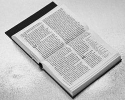
Its innovative feature is printing the text across two pages in landscape orientation, eliminating wasted space, permitting more words per page, and a larger font than any other book of this size (12 x 8 x 3cm).
The result is a dramatically compact volume, but with a normal-sized font, ideal for portability, so you can read God’s word anywhere, any time.
Twisting the text ninety degrees enables you to read down and across both pages, viewing them as a single page. Additionally, by printing on ultra-thin paper, the total weight and thickness of the Bible is a fraction of its counterparts, and more compact than a Kindle or iPad.
You can understand why the concept of small light Bibles appeals to missionaries like me, for transporting God’s word into unreached nations. So I was thrilled to receive a review copy from the kind people at Cambridge Bibles.
First Impressions
Examining a Cambridge KJV Transetto Bible is an experience to savour. From the publicity it appears to be a paperback brick, but after one touch all disdain evaporates, you sense the quality, and appreciate the thoughtful design features.
If you travel as frequently as I do, and carry a small KJV Holy Bible, this little gem will leap right into your heart at first meeting. It weighs less than a couple of quarter-pound burgers, and will feed your spirit for eternity. Similar in size and weight to a bar of soap, but its message will cleanse and purify you fit for Heaven.
Flipback®: The Flip Flop Cover
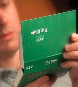
The cover isn’t paper, but a luxury stiff card with an ivory sheen and delightful feel. I chose the soft green, you may prefer pastel purple, or blue. The book headings, and chapter numbers, colour-coordinate with the binding, lending the main text a clean, bright, modern touch.
 Image courtesy of CUP
I admire the way the binding declares, KJV: The Bible rather than “Holy Bible”. The definite article for The definitive word of God in English. It evoked a smile even before I looked inside.
Big black book traditionalists, need not be alarmed for the frontispiece has, “The Holy Bible King James Version” etc, just like any other Cambridge Bible.
The cover flip-flops right back to lie perfectly flat, hence the term Flipback® that Jongbloed have trademarked for this revolutionary new book format.
The original name was the Dutch term dwarsligger®, meaning; unconventional, awkward, against the grain.
 Image courtesy of 2Krogh
Whilst the world is franticly “going digital” by reading on; iPhones, iPads, and Kindles, these ingenious Low-Landers have reinvented the paperback book for the 21st. century. How analog can you get? They are my kind of people, and I salute them.
The Book with a Backbone you can See
The matt black end-paper blends into a Smyth sewn spine, consisting of nineteen signatures, neatly covered with a strip of matt-black linen binding material. It looks exposed, unconventional, and interesting, enabling the open book to lie absolutely flat under its own weight. Clever, simple, and neat: Why didn’t we think of it?
Thin: Opaque and Bright White
The Indolux paper made by French company Bolloré Thin Papers, is the thinnest India Bible paper I’ve come across (30µm, 27gsm, 87% opacity and whiteness). It feels so thin you automatically turn pages with extra care. Time will tell if the initial impression of delicacy is warranted.
The surface has typical Bible paper smoothness that sings quality, pages separate and turn effortlessly. No digging at the edges with your nail, or licking of thumbs required with a Cambridge Transetto Bible.
Indolux is manufactured from pulp without using chlorine or sulphur bleaching agents, and comes from sustainable responsibly managed sources approved by the Forest Stewardship Council. Smaller books using ultra-thin paper means less trees are felled, so that should keep the Greenies happy.
The pages are so thin that, when held up to a light, you see an array of star-like “pin-pricks” formed in the matrix of pulp fibres.
Ghost-busting Bible
However, the use of ultra-lightweight 27gsm paper doesn’t mean there’s excessive “ghosting” (aka. “strike-through” or “bleed-through”), where text shows through from the reverse side of the page.
What ghosting there is, occurs to the same degree in my pocket-sized Cambridge Brevier KJV New Testament and Psalms, whose paper feels twice as thick as the Transetto’s. The ghosting is no more, perhaps less, than in a full size Cambridge Standard Text KJV. So thin paper ghosting is not a problem at all. Cambridge utilize this same specification paper for their latest Pitt Minion Bibles.
The printers, Jongbloed of Holland, and the typesetters, 2Krogh of Denmark, have avoided text ghosting by skilful combination of three methods.
- First, they chose a regular font, instead of the bold fonts traditionally used for pocket texts.
- Second, the verses flow continuously rather than each starting on a new line. So there’s less white space at the end of each verse.
- Third, the alignment of the text on each side of the page perfectly superimposes line upon line.
Most quality Bibles are printed with this care, but check a cheaper Bible and notice how random the alignment can be.
If you’ve dabbled in printing, you’ll know how difficult it is to achieve good, let alone the perfect imposition you find in the Transetto.
What Size Font do You Take?
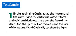
I’d heard that the font size was 7 point, which is what I’m used to reading, so I expected it to be as legible as my other Cambridge editions. However, although the digital Karmina sans font is indeed 7 point, and the same size as other 7 point fonts, it gives the impression of being slightly smaller, say six point, perhaps because it is regular, not bold or semi-bold.
 Image courtesy of CUP
Nonetheless, I experienced no difficulty reading unaided, and, at my first sampling, enjoyed the Epistle Dedicatory, and two whole chapters without a trace of eyestrain or squinting.
Remember, when reading a book, or computer screen, to rest your eyes every ten minutes by refocussing on an object in the distance for a few seconds, it gives your lens muscles opportunity to relax.
Personally, for decades I’ve longed for a Cambridge Standard Text KJV with a crisp digital font. It’s no secret that the Royal Printer has navigated choppy seas in recent years, particularly in regard to the quality of text blocks printed in the former Soviet Union.
In addition, the master stereotype plates of the classic KJV Cambridge settings have deteriorated with age. That is why some popular editions had to be discontinued. So the 400th. anniversary of the King James Bible affords the ideal occasion for the design of new settings, new formats, and to re-master the classics.
Perhaps you prefer a reverential Gothic font, or the familiar Times bold fonts Cambridge have long used. Maybe you view A non-serif digital font for the Gospel text as another indication of modern decadence.
Try the Transetto and see for yourself, the Karmina sans font is clean, clear, and beautifully printed. No lopped off edges of letters, no patchy inking, broken lines, or variable density, just the plain word in sharp black and white: Divine!
Nothing but The Truth: The Whole Truth
Another appealing improvement is the absence of; pronunciation marks, footnotes, and cross references, only the paragraph (pilcrow ¶) symbol remains. Away with man-made intrusions, let there be nothing between us and the Word other than the Spirit of God.
The Text retains the headings of Psalms, such as, A Psalm of David, when he fled from Absalom his son. And notes at the ends of the Epistles, like, Written to the Romans from Corinthus, and sent by Phebe servant of the church at Cenchrea. But the book headings are pruned to the basics. Not the Standard Text headings such as, The Epistle of Paul the Apostle to The Romans: But simply, Romans.
The body text consists of the Cambridge Standard Text of 1769 as it was edited for the Concord setting in the 1950s, complete with italics, and no quotation marks of course.
How Does it Perform?
Reading the new double landscape format, by turning the book edgeways-on, may sound contrived and awkward, but it comes as naturally as breathing. Using a Transetto for the first time, you discover what your hand was made for: Reaching out and holding onto the word of God. Its tiny size, and light weight, balance perfectly over the point where your fingers join your palm. It is easy to read it one-handed, and feels perfectly natural.
Bible book titles are printed in the left margin of each top page at ninety degrees to the body text. This makes finding the book you want as easy as in an ordinary Bible. When you locate the book, open fully and rotate through ninety degrees to read.
One ergonomic suggestion I have for the designers is to add the chapter numbers to these marginal book titles, currently as you scan through the book, you have to lift your eyes to the body text to tell which chapter you are flicking through, tilting your head like this through 150 Psalms is unnecessarily tiring.

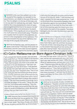
Incidentally, there’s a small debit to the ultra compact format when you look at the Psalms. These inspired lyric poems and songs are best formatted in stanzas and lines in rhythm.
The Standard Text rigidly keeps the new-line-per-verse format, but at least that is better than the continual verse format of the Transetto.
Perhaps if we lobby the publishers to print a Transetto KJV New Testament and Psalms, they would then have room to accommodate a more sensitively formatted book of Psalms.
How long will it last?
A portable Bible needs to be robust and durable, as well as small and light. This one is truly purse-sized, and slots into the pockets of my shirt, jacket, and cargo shorts. It’s a bit thick to carry comfortably in your trouser or jeans pockets, you need a slimline Testament for that.
Remember that the edges of the Transetto text block are fully exposed, with no yapp or gilt, so they are vulnerable to moisture and damage. This shouldn’t trouble the ladies, who will find a suitable sized compartment for it in their handbags and purses. Just ensure you don’t include keys and coins in the same section.
Gentlemen may find carrying it in their brief case convenient, but the text block is more laterally mobile than a conventionally bound Bible, so it would soon twist off the binding if subjected to rough handling.
Fortunately, the solution is simple; make your own slipcase, or find a camera pouch to pop it in. I made a slipcase from a box that a mobile-phone was sold in, but I’m going to enjoy designing a soft leather case too. Creative ladies can personalise their carry Bibles by sewing a colourful embroidered cloth case.
I’m surprised Cambridge released this product without a slipcase, it really should be standard. Perhaps they were overloaded with 400th. anniversary deadlines, and it’s already in the pipeline.
What’s the Verdict?
Transetto: Magnifico! You can tell that I love this new KJV Bible, it has replaced the Cambridge Brevier KJV NT in my knapsack, to become my main portable Bible. I’ll buy a stock of spares to give away as gifts, until the PCE is available. (The Transetto is almost, but definitely not PCE.)
You may wish to read more about the Pure Cambridge Edition KJV text. Which can be download free here: PCE KJV Bible
What really excites me is the thrill we share with our dear brother in the Glory, William Tyndale. He would rejoice and praise God to see this new Bible. Its message is as urgently needed today as in the sixteenth century. Tyndale’s vision was to put God’s word in simple English into the hands of every man, woman, boy, and girl, so that they could read for themselves what Christ has done for us, and how to receive salvation from sin, and all its consequences.
William Tyndale translated Erasmus’ 1522 Greek Textus Receptus into beautiful vibrant English, printed thousands of tiny New Testaments for the first time ever, and smuggled them into England. His boldness, devotion, and vision, opened the way for the English Reformation, and for the KJV, whose Translators honoured him by making the KJV NT 84% word for word identical to Tyndale’s 1534 NT translation.
What would Jesus (and Bill) do?
What would William Tyndale do with the Transetto format?
He’d translate the New Testament into the native tongues of ploughboys the world over, and smuggle New Testaments into every nation that tries to restrict the proclamation of God’s Word.
This is the beauty of the Transetto format. It’s small, light, inexpensive to print, and can easily be concealed for transportation, and secreted by believers in oppressed nations.
Missionaries the world over need to have this new invention, it will inspire them to get the Gospel in the same format in their target languages. Do the missionaries and Bible translators that your fellowship supports know about this exciting development? Please send them a copy today. It is seed the Lord will bless, and is sure to grow and flourish.
Note: Hampton Court Palace is depicted at the top of this article. There, in January 1604, King James convened a conference with leaders of the Church of England, and Puritans, which resulted in Royal Authorisation of the KJV Bible of 1611.
© 11 Colin Melbourne
